

Good colour combinations are tough to crack. But with a bit of research and a lot of imagination, you can avoid colour combination mistakes.
You can play with colours on walls, ceilings, doors, and woodwork with Berger interior paint. The choice and combination of colours can make or break your home’s aesthetic. Here are some tips for you to keep in mind to make sure your colour schemes work well together.
Gold Rate
18 dec 2025

Avoid Using Only Warm or Only Cool Colours
Shades of red, orange, and yellow are all warm colours and stimulate stronger emotions. On the other hand, hues of green, blue, and purple are cool colours that cause calmness and help to focus your thoughts. It’s a great idea to use different odd colour combinations of warm and cool in different rooms to give your home a holistic feel.
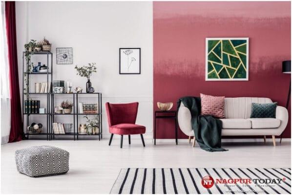
Use strong colours sparingly to accentuate rather than define a space. For example, when aiming to create a warm living room, paint one wall red. Choose a bold texture to make more of a style statement. The other walls can be off-white. You can complement these with wooden furniture that have a bold design. The smaller sofas can be light brown. Finally, place a throw with a red and brown design toward the centre of the room.
Use Red Sparingly
Red stimulates the senses and can trigger feelings of motivation and passion. Red gets your adrenaline pumping and can boost your energy levels. So, this colour is better for your living room than your bedroom. When choosing colours for the bedroom, it’s a good idea to choose cooler colours that will help you relax and enjoy deep sleep at night.
Similarly, when painting a smaller room, lighter shades of red will work better than bright red. A smaller room with light red or pink can create an energising and welcoming atmosphere.
You can use the Colours & Emotions tool online to choose colours according to the emotions you wish your home to exude. You can also use tools to visualise how a combination using red works in every room. Paint the walls virtually, add related colours to the palette and discover which shade of red best suits your needs.
Neutral is Safe but Not on Its Own
There are certain colours that lack “colour,” like beige, ivory, and grey. The good thing is that these colours are compatible with almost every hue out there. They are not very appealing themselves but can accentuate other colours and make the room exciting and stylish. So, use oranges, yellows, and purples in various rooms but accentuate them with the smart use of neutrals. You can use Berger paints for interior walls as these are 100% acrylic, eco-friendly and good for the health of your loved ones.
Wish to choose an only neutral colour scheme for certain rooms? Consider using textures on the main walls of these rooms to give your home a unique and trendy feel. Warm metallics like brass and bronze and natural wooden furniture go well with these colours. You can even liven up the room with strategically placed flashes of colour through curtains, throws and pillows. This allows your neutral design to breathe between the colours, while adding energy to the living area as a whole.
Do Monochrome Justice
As tempting as it is to use one shade of one colour to match everything in a room, you don’t want your space to appear as though it’s been suffocated. If you are keen to use only one colour, monochrome is the style for you. It creates a modern, elegant, and stylish aesthetic. Use the 60-30-10 colour theory to master balancing the tones of a single colour to create a visual statement. This theory dictates that 60% of space include the dominating shade, 30% use the secondary shade and the remaining 10% of the space is in accent colours.
The dominant colour is usually a neutral tone for the walls, flooring, or carpets. For secondary colour, consider bigger items such as drapes and couches in a mid-tone shade. Accent colours work best with smaller objects, artwork, and are usually a more saturated shade.
Conclusion
These colour mistakes are just a few things that can go wrong with a paint project. Be confident in your colour choices by trying out combinations put together by industry experts through the Shade Genius tool. This tool lets you select the target room and your style preference to offer you numerous colour combination ideas. The best way to avoid colour combination mistakes is to consult painting professionals. With Berger’s Express Painting Services, you can rest assured that the colour combinations give a sophisticated and trendy feel to your home. The painting professionals will estimate the amount of paint you need for your home and complete the job in a fast and hassle-free way. Use the Berger Express Painting app for a contactless, paperless, and cashless experience.